Friday, 4 May 2012

The Guggenheim, New York

Own photo
 This is the Guggenheim in New York, designed by Frank Lloyd Wright. Wright designed the building so that you took a lift up to the top floor and then walked down the slope to the bottom. When I was there this was not advertised that it was the correct way, and my family and I only found out about this after we had been to the gallery. The building is very different to my thoughts of Wrights work, Very light, with white render on the exterior and pale and light materials inside.
Own photo
 I personally don't think the widow letting the majority of the light into the stairwell matches the rest of the design. It does not flow, like the sloped ramp, or the ribbon window shaft going down the outside. It is very harsh and jagged. I do however love the idea of having lots of natural light, as it gives a positive feel to a space.
Own photo

Cool Partition

Uber cool and very smart watch mechanism partition in a watch emporium inside the Bellagio Casino shopping mall, Las Vagas.

Own photo

Wednesday, 2 May 2012

Bauhaus and colours

Scanned in from Vogue
I love the simplicity of the primary colours. They make an outfit fun, yet still fashionable.
The colours make me thing of Kandinsky's art work because of the colours and simplicity of lines. I've have always liked the work of this artist. Its futuristic and takes a different stand to painting, than Monet etc, which means I find it much more interesting because its so atypical and crazy.

Monday, 30 April 2012

Stage Design


 I've always been interested in stage design. I go to see the live streams of the MET Opera in NY with my parents, and the stage designs are beautiful. Satyagraha, is an opera written in Sand Script about Ghandi's life. The staging was very experimental, with large puppets made out of newspaper (seen below). The materials used are very basic, this could mirror Ghandi's life.

 
Performing to a 7000 strong audience at Lake Constance 'The Marvelous Floating Stage of the Bregenz Festival' in Austria are on different level, the fact that they float is crazy. The designs are on such a large scale, I wonder how hard it would be to be heard from an actors point of view.
 These photos are from random years panning back to 2002.
Especially against the backdrop of the sky and the sea, all these stages looks crazy. The one which backdrop is the dark sky looks so impressive, and I'd love to go and experience the stage.


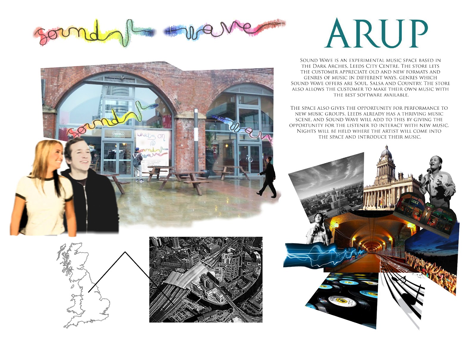
Some boards from Arup lighting collabarative project - Sound Wave, Leeds


Friday, 27 April 2012

La Pâtisserie des Reves

A patisserie in France is normally a very basic space, just for the object of selling bread and cakes etc, but this patisserie in Paris brings selling baked goods to a whole new level.
I love the futuristic design of this bakery, the counter weighted bell jars which lift the jar up when the user requests its content makes, and the refrigerated slate keeps the item cool while it waits.

The way the pods are placed equally along the work space creates the feeling that each cake is special and a work of art. This also creates the sense that the cakes are of the very best quality. From research of the shop, some cakes are priced as high as 33 Euro, which adds to fact that each individual cake is very precious, and should be protected from the outside world until chosen to enter.

I particularly like the frontage to the shop. Its very simple, with a few details to suggest what it sells beyond the doors e.g the door handles are a great touch. The font and use of colour make the shop feel prestigious, new and exciting. Unlike a standard french bakery, this patisserie brings buying bread, tarts and cakes a brand new exciting level. The experience is fresh and makes the everyday chore of the french people special.

Thursday, 19 April 2012

Franz Klein

Franz Klein's work is very powerful. The large thick dramatic brush strokes within his absract expressionist work evoke depth and complexity; as he may have been his life to be.
 Klein orginally started painting around 1940 with just monocrhome colours, but then late in 1956, he started to introduce slithers of colour into his paintings, this may have been because he moved to Provincetown, Massachusetts.
For my A level work, I studied Franz Klein for the strong brush lines, dark colours and general boldness of the pieces.
 The blue painting at the bottom of the collection here, is my favorite. The colours is so bold and spontaneous.